If you've missed the first two parts to this series, find out about
setting up your product photo here and
taking your photo here. In this final blog post, we're going to think about editing your photos so that they sell your items as well as possible.
Load the pictures from your camera onto your computer and sort them out into folders, one for each product. Go through the photos for each item and select the photos that you think are best. Make sure they are in focus, and choose a range of photos so that you have at least one that shows the whole product and one or more close up shots where the detail is clear.
Open up the photos you have selected in a photo editing programme. There are many different ones you could use, don't feel you have to splash out on photoshop (although an older version of photoshop elements can be pretty cheap and will have more tools than you could possibly need). If you don't already have any photo editing software on your computer, try an online version for free -
PicMonkey and
iPiccy are two popular ones.
The first two things to do are crop and brighten the picture. If you don't do anything else it is definitely worth spending a minute or two on these. First, trim the photo to the size and shape you need. Does it need to be square for example? Then brighten your picture a little. No matter how hard you try to get good lighting when taking the photos they will probably still look a little bit dull, and increasing the brightness can make a big difference to how your product looks.
Compare these two photos for example. The first one is the original and the one underneath has been brightened up.
 |
| Original photo - bit dark |
 |
| Brightened photo - looks much better |
Tracy from
Cinnamon Jewellery always makes these two adjustments to her product photos. She says:

"I always edit my photos with Paint Shop Pro. Usually it's just a slight tweak of the contrast/brightness settings. This will lighten the photo and add depth. I sometimes edit the colour if it looks duller than it should but it's important not to get carried away and end up with the colour looking too bright for obvious reasons! I then crop my photos square. I crop fairly close to the item so it's the main focus of the photo. Experimenting with how you crop is worth doing too – how you crop alters the position of the item within the photo and can make it really stand out if done right."
That may be all the editing you need to do to your photo. If you're happy with it go ahead and save it. But a few more tweaks that you might like to consider are:
- Adjusting the colour balance - especially if you have any white areas that look a little blue.
- Editing out any flaws - for example you may have a mark on your background that you want to erase.
- Making sure your background goes right to the edge of your photo - you can fill in any gaps with the same colour. It doesn't look very professional to try taking your photos on a coloured piece of card, but in one corner the card runs out and you can see the table underneath. If you didn't intend it to be there, get rid of it.
- Lighten dark shadows - if you think the shadows have come out a bit dark you could lighten these.
- Sharpen the image - if your best photo is still a little out of focus see if this adjustment helps.

"Once I've taken a set of photos I try and select a few complimentary shots. Each photo gets edited in Photoshop. I use the auto contrast first, then adjust the levels manually by eye. I don't think that automatic functions are a replacement for the human touch! Sometimes I adjust a photo's colour balance as well if its looking too blue or too yellow dependent on the light you get on any given day."
In this photo for example I needed to get rid of my thumb and the gap at the edge of the background, making sure the white background went right to the edges of my picture. I also adjusted the colour balance because it looked a bit blue, as well as brightening it all up a bit. You can see the difference with the photo underneath.
 |
| Edit that thumb out! |
 |
| Nothing to distract from my notebook now |
To find out how to make any of these adjustments, do a google search for the photo editor you are using, there are loads of helpful tutorials online.
If you are using a white background try and make sure it is really white. It might look white, but when you put it against a white background it will look dull if it's not pure white. Here are two ways I use to make my product pictures have perfectly white backgrounds:
Increasing brightness
Increase the brightness of the background only. You can do this by creating an adjustment layer in photoshop and filling in the shape of your product in black so that the brightness is only applied to the background and not the product.
In the layers palette click on the little half black half white circle and select brightness/contrast from the drop down menu. Then increase the brightness, concentrating on making the background nice and white without losing all shadows (don't worry about fading your item).
Then colour in the shape of your item in black and it won't apply the brightness adjustment to this shape. This method works best for products with a simple outline, such as cards, which can be easily traced.
Using the dodge tool
The dodge tool is great for coloured items. Use the highlights mode, and around 20% exposure. Simply colour over the areas you want to be white, and it should make the white bits whiter whilst leaving the coloured areas as they are. There is also a dodge tool on
ipiccy that you can use for free.
Do you have more photo editing tips? Please share them in the comments below this post. There are probably hundreds of great fixes that you can apply to make your photos stand out, but I hope these few tips have been helpful to start you off.
A huge thank you to my fellow Folksy sellers who have helped me out with this series of posts.


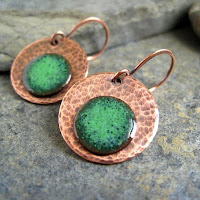 "Taking photos of jewellery means you have to get close up in order to show details so using the macro setting on your camera is essential. It's usually the button with the tulip symbol and will focus on small details when the camera is close to the item. My camera allows me to get very close to items, within 2 inches, so I can pick out a particular detail I want to show. It's worth reading your camera manual and experimenting with settings to get the best results. I found experimenting with the manual settings on my camera produced better all round results than using the auto setting."


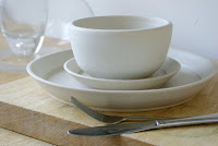 "I've tried all sorts with photos; white backgrounds, black backgrounds, light boxes. It's important to find a style that's comfortable for you to shoot in and get good results. I tend to think photos should have character and reflect something of your product regardless of what you sell. For me lifestyle photos are just more interesting to look at. I think having good photos makes you stand out from everyone else and it's how your customers experience your products without being able to touch them."
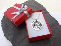 "The consistency of photos generally is that I take photos in my conservatory where there is better light, use the same background, same zoom and macro settings each time. Sometimes I try to use red jewellery boxes so people get an idea of how their gift will arrive too, or hold jewellery in my hand with slate in the background so they get an idea of size of an item as people don't always equate dimensions to the correct size."


