Crikey. Takes a look around. Am I in the right place? What's going on here? Where's all this orange come from?!
Well, what do you think? After 18 months of running say it I felt it was time for a little bit of a makeover. I wanted to freshen up my branding and make it a little bit sleeker and a tad more fun. So as part of the say it relaunch I've designed a new look. Hopefully it compliments my range of products well.
I've also tidied up the blog a bit. Two sidebars seemed to make it a bit cluttered, so the new look gives more space for blog posts. Have a look around and let me know what you think.

Sign up to receive a fortnightly email from say it with news and fresh designs

Wednesday, 27 February 2013

Monday, 25 February 2013
Handmade notebooks
It's day one of the say it relaunch week and to celebrate I'm relaunching my popular range of notebooks. And if you pop back on Wednesday you'll be able to see the new say it branding too (there's a sneak peek at the bottom of this blog post!).
Map covered notebooks were my first product to really take off. Then I added notebooks made with sheet music and they quickly caught up on the sales tally. I loved making them, but one thing bothered me: they were not totally handmade. Fabulous handmade covers that I put a lot of time and effort into were paired with average quality lined paper insides. I knew they could be better.

Map covered notebooks were my first product to really take off. Then I added notebooks made with sheet music and they quickly caught up on the sales tally. I loved making them, but one thing bothered me: they were not totally handmade. Fabulous handmade covers that I put a lot of time and effort into were paired with average quality lined paper insides. I knew they could be better.

Friday, 22 February 2013
Folksy Friday: My favourite bags
I'm looking for a new bag. And naturally I turn first to my favourite handmade makers to see what they have to offer. The trouble is, I can't quite decide what sort of bag to get. So I've been browsing Folksy for my favourites. These are all so nice that I might have to end up getting more than one!
If any take your fancy, the links to the shops are underneath. Just don't buy the one I want before I've made up my mind!

If any take your fancy, the links to the shops are underneath. Just don't buy the one I want before I've made up my mind!

Green and cream floral 'Bethan' bag by CoCo Crafts
Floral handbag by Susie D Designs
Owl print tote bag by Peris and Corr
Bear design tote bag by Alice Blue Designs
Large butterfly tote bag by Beledien
The 'Tuck' leatherette handbag by Jooles Bespoke Handbags
Book bag in retro rosebud fabric by Personal Space Interiors
Meadow embroidered and felted shoulder bag by Lynwoodcrafts
Wednesday, 20 February 2013
The say it relaunch!
You may remember a little while ago I showed you a sneak peek of my new branding. I'm brightening things up with a touch of orange and a cleaner, more professional looking image. I have been working very very hard and I'm so excited that it's nearly time to put my new branding into place.

Along with a fresh new look, I'm launching my new and improved notebooks as well as a brand new website. I thought I'd roll all these together into a bit of a relaunch for say it. From next week onwards I shall be the designer-maker behind a contemporary handmade card and gift shop that looks as good as the products it sells.
Will you join me in celebrating the relaunch and share say it with all your friends and family? Here's the plan:

Along with a fresh new look, I'm launching my new and improved notebooks as well as a brand new website. I thought I'd roll all these together into a bit of a relaunch for say it. From next week onwards I shall be the designer-maker behind a contemporary handmade card and gift shop that looks as good as the products it sells.
Will you join me in celebrating the relaunch and share say it with all your friends and family? Here's the plan:
Monday, 18 February 2013
Interesting reads #3
It's been too long since I last shared with you some of the things I've found on the interweb of late. When I find a new blog post, DIY or e-book that makes me smile I like to share them with my lovely readers and spread the love. So here's a fab mix of everything wonderful I've found recently.

Shared on Paper Art Love
Thursday, 14 February 2013
Folksy Five #14
It's time to show you five more of my favourite Folksy shops. This week I've chosen five supplies shops. I've not featured any supplies shops before as I like to focus on handmade items. But every handmade item needs materials, and these shops have such gorgeous items. It's time for a good browse through the buttons, beads, paper, fabric and yarn that these wonderful shops have to offer - just click on the shop banners.


And they've all had a look through my Folksy shop, and have chosen the following items as their favourites:
And they've all had a look through my Folksy shop, and have chosen the following items as their favourites:
|
|
|


|
|


Tuesday, 12 February 2013
Photographing your handmade items: part 3
If you've missed the first two parts to this series, find out about setting up your product photo here and taking your photo here. In this final blog post, we're going to think about editing your photos so that they sell your items as well as possible.

Load the pictures from your camera onto your computer and sort them out into folders, one for each product. Go through the photos for each item and select the photos that you think are best. Make sure they are in focus, and choose a range of photos so that you have at least one that shows the whole product and one or more close up shots where the detail is clear.

Open up the photos you have selected in a photo editing programme. There are many different ones you could use, don't feel you have to splash out on photoshop (although an older version of photoshop elements can be pretty cheap and will have more tools than you could possibly need). If you don't already have any photo editing software on your computer, try an online version for free - PicMonkey and iPiccy are two popular ones.
The first two things to do are crop and brighten the picture. If you don't do anything else it is definitely worth spending a minute or two on these. First, trim the photo to the size and shape you need. Does it need to be square for example? Then brighten your picture a little. No matter how hard you try to get good lighting when taking the photos they will probably still look a little bit dull, and increasing the brightness can make a big difference to how your product looks.
Compare these two photos for example. The first one is the original and the one underneath has been brightened up.
Tracy from Cinnamon Jewellery always makes these two adjustments to her product photos. She says:
 "I always edit my photos with Paint Shop Pro. Usually it's just a slight tweak of the contrast/brightness settings. This will lighten the photo and add depth. I sometimes edit the colour if it looks duller than it should but it's important not to get carried away and end up with the colour looking too bright for obvious reasons! I then crop my photos square. I crop fairly close to the item so it's the main focus of the photo. Experimenting with how you crop is worth doing too – how you crop alters the position of the item within the photo and can make it really stand out if done right."

 "Once I've taken a set of photos I try and select a few complimentary shots. Each photo gets edited in Photoshop. I use the auto contrast first, then adjust the levels manually by eye. I don't think that automatic functions are a replacement for the human touch! Sometimes I adjust a photo's colour balance as well if its looking too blue or too yellow dependent on the light you get on any given day."
To find out how to make any of these adjustments, do a google search for the photo editor you are using, there are loads of helpful tutorials online.

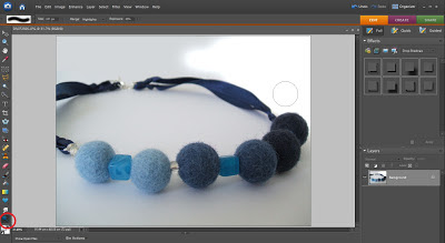
If you are using a white background try and make sure it is really white. It might look white, but when you put it against a white background it will look dull if it's not pure white. Here are two ways I use to make my product pictures have perfectly white backgrounds:
Increasing brightness
Increase the brightness of the background only. You can do this by creating an adjustment layer in photoshop and filling in the shape of your product in black so that the brightness is only applied to the background and not the product.
 In the layers palette click on the little half black half white circle and select brightness/contrast from the drop down menu. Then increase the brightness, concentrating on making the background nice and white without losing all shadows (don't worry about fading your item).

Then colour in the shape of your item in black and it won't apply the brightness adjustment to this shape. This method works best for products with a simple outline, such as cards, which can be easily traced.
Using the dodge tool
The dodge tool is great for coloured items. Use the highlights mode, and around 20% exposure. Simply colour over the areas you want to be white, and it should make the white bits whiter whilst leaving the coloured areas as they are. There is also a dodge tool on ipiccy that you can use for free.
Do you have more photo editing tips? Please share them in the comments below this post. There are probably hundreds of great fixes that you can apply to make your photos stand out, but I hope these few tips have been helpful to start you off.
A huge thank you to my fellow Folksy sellers who have helped me out with this series of posts.

Load the pictures from your camera onto your computer and sort them out into folders, one for each product. Go through the photos for each item and select the photos that you think are best. Make sure they are in focus, and choose a range of photos so that you have at least one that shows the whole product and one or more close up shots where the detail is clear.

Open up the photos you have selected in a photo editing programme. There are many different ones you could use, don't feel you have to splash out on photoshop (although an older version of photoshop elements can be pretty cheap and will have more tools than you could possibly need). If you don't already have any photo editing software on your computer, try an online version for free - PicMonkey and iPiccy are two popular ones.
The first two things to do are crop and brighten the picture. If you don't do anything else it is definitely worth spending a minute or two on these. First, trim the photo to the size and shape you need. Does it need to be square for example? Then brighten your picture a little. No matter how hard you try to get good lighting when taking the photos they will probably still look a little bit dull, and increasing the brightness can make a big difference to how your product looks.
Compare these two photos for example. The first one is the original and the one underneath has been brightened up.
 |
| Original photo - bit dark |
 |
| Brightened photo - looks much better |
Tracy from Cinnamon Jewellery always makes these two adjustments to her product photos. She says:
"I always edit my photos with Paint Shop Pro. Usually it's just a slight tweak of the contrast/brightness settings. This will lighten the photo and add depth. I sometimes edit the colour if it looks duller than it should but it's important not to get carried away and end up with the colour looking too bright for obvious reasons! I then crop my photos square. I crop fairly close to the item so it's the main focus of the photo. Experimenting with how you crop is worth doing too – how you crop alters the position of the item within the photo and can make it really stand out if done right."
That may be all the editing you need to do to your photo. If you're happy with it go ahead and save it. But a few more tweaks that you might like to consider are:
- Adjusting the colour balance - especially if you have any white areas that look a little blue.
- Editing out any flaws - for example you may have a mark on your background that you want to erase.
- Making sure your background goes right to the edge of your photo - you can fill in any gaps with the same colour. It doesn't look very professional to try taking your photos on a coloured piece of card, but in one corner the card runs out and you can see the table underneath. If you didn't intend it to be there, get rid of it.
- Lighten dark shadows - if you think the shadows have come out a bit dark you could lighten these.
- Sharpen the image - if your best photo is still a little out of focus see if this adjustment helps.
Victoria from Little Wren Pottery adds her top tips for editing your product photos:
"Once I've taken a set of photos I try and select a few complimentary shots. Each photo gets edited in Photoshop. I use the auto contrast first, then adjust the levels manually by eye. I don't think that automatic functions are a replacement for the human touch! Sometimes I adjust a photo's colour balance as well if its looking too blue or too yellow dependent on the light you get on any given day."
In this photo for example I needed to get rid of my thumb and the gap at the edge of the background, making sure the white background went right to the edges of my picture. I also adjusted the colour balance because it looked a bit blue, as well as brightening it all up a bit. You can see the difference with the photo underneath.
 |
| Edit that thumb out! |
 |
| Nothing to distract from my notebook now |
To find out how to make any of these adjustments, do a google search for the photo editor you are using, there are loads of helpful tutorials online.

Increasing brightness
Increase the brightness of the background only. You can do this by creating an adjustment layer in photoshop and filling in the shape of your product in black so that the brightness is only applied to the background and not the product.


Then colour in the shape of your item in black and it won't apply the brightness adjustment to this shape. This method works best for products with a simple outline, such as cards, which can be easily traced.
Using the dodge tool
The dodge tool is great for coloured items. Use the highlights mode, and around 20% exposure. Simply colour over the areas you want to be white, and it should make the white bits whiter whilst leaving the coloured areas as they are. There is also a dodge tool on ipiccy that you can use for free.

Do you have more photo editing tips? Please share them in the comments below this post. There are probably hundreds of great fixes that you can apply to make your photos stand out, but I hope these few tips have been helpful to start you off.
A huge thank you to my fellow Folksy sellers who have helped me out with this series of posts.
Subscribe to:
Posts (Atom)
