

The first thing to think about is setting up your shot. What do you want your product photo to look like? What type of background would you like? And do you want to use any props to enhance your product?

|
|
|


Decide on the type of background you want to use. Will you go for studio style shots with white backgrounds, model your items on real people or use props to enhance your products?
Jenny from Little Red Robin photographs her handmade jewellery and keepsakes on a slate background. Jenny says:

It's important to choose a background and photo style that matches your products. Victoria from Little Wren Pottery takes some very impressive lifestyle shots of her contemporary dinnerware. I asked her about her photos.
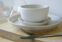 "I've tried all sorts with photos; white backgrounds, black backgrounds, light boxes. It's important to find a style that's comfortable for you to shoot in and get good results. I tend to think photos should have character and reflect something of your product regardless of what you sell. For me lifestyle photos are just more interesting to look at. I think having good photos makes you stand out from everyone else and it's how your customers experience your products without being able to touch them."
If you decide, like me, that a white background suits your products and looks most professional then simply place your items on a white piece of card (or two - don't worry about joins, these can be edited out later). This is what my set up looks like:


Think about the angle that you could take the photo from. Square on photos often don't show enough depth, so consider taking the shot slightly from one side. Similarly, compare these two photos and note how the angle of the shot changes the overall effect of the photo. Everything else stayed the same, I just moved my camera.
|
|


Try to get a consistent look for all your shop photos. So if you go for a plain white background, you should have all your main product photos white. Or if you choose a lifestyle shot modelling the item you need to think how you can do this for all your items. Use the same lighting and the same angles to take similar shots of each of your products. Of course, you will want to have additional pictures of each item which could be different, but to keep a consistent look to your shop take your main product photos in the same way.
Take a look at the Little Red Robin shop on Folksy. Notice how nearly all the pictures have the same slate background to tie them all together and they look like a cohesive set of product images. Jenny says:
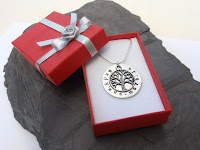 "The consistency of photos generally is that I take photos in my conservatory where there is better light, use the same background, same zoom and macro settings each time. Sometimes I try to use red jewellery boxes so people get an idea of how their gift will arrive too, or hold jewellery in my hand with slate in the background so they get an idea of size of an item as people don't always equate dimensions to the correct size."
I hope that's helpful. Have a play around until you come up with a shot that you are happy with. And if you have any tips about setting up a good product photo please share them in the comments.
Now pop over to Part 2: Taking the photo, where we have a think about cameras, lighting, tripods and macro settings.
Take a look at the Little Red Robin shop on Folksy. Notice how nearly all the pictures have the same slate background to tie them all together and they look like a cohesive set of product images. Jenny says:
"The consistency of photos generally is that I take photos in my conservatory where there is better light, use the same background, same zoom and macro settings each time. Sometimes I try to use red jewellery boxes so people get an idea of how their gift will arrive too, or hold jewellery in my hand with slate in the background so they get an idea of size of an item as people don't always equate dimensions to the correct size."I hope that's helpful. Have a play around until you come up with a shot that you are happy with. And if you have any tips about setting up a good product photo please share them in the comments.
Now pop over to Part 2: Taking the photo, where we have a think about cameras, lighting, tripods and macro settings.
Thankyou very much for including Little Red Robin Jewellery as part of your interesting blog on photos for products. Also thank you for informing me of the post. Its interesting to see other people's photos for products too. A good post
ReplyDeleteJenny
A great post, I usually use white but I agree that it mainly depends on the product, the plates etc look lovely in their setting and gives a better idea of size and there is just the right amount of colour. I think to many different colours make things look cluttered.
ReplyDeleteLittle Red Robins photo's are lovely, I like the use of the red.
Jan x
Very clear and informed post, thank-you for sharing. have a good week-end, Jo x
ReplyDeleteFantastic post! I always struggle with the photography side of things.
ReplyDeletexx
Thanks for you lovely comments. I always find it encouraging to know I'm not talking to myself!
ReplyDeletePart 2 is now available http://sayitsays.blogspot.co.uk/2013/02/photographing-your-handmade-items-part-2.html